Paul Holmes 26 Jun 2017 // 7:45AM GMT
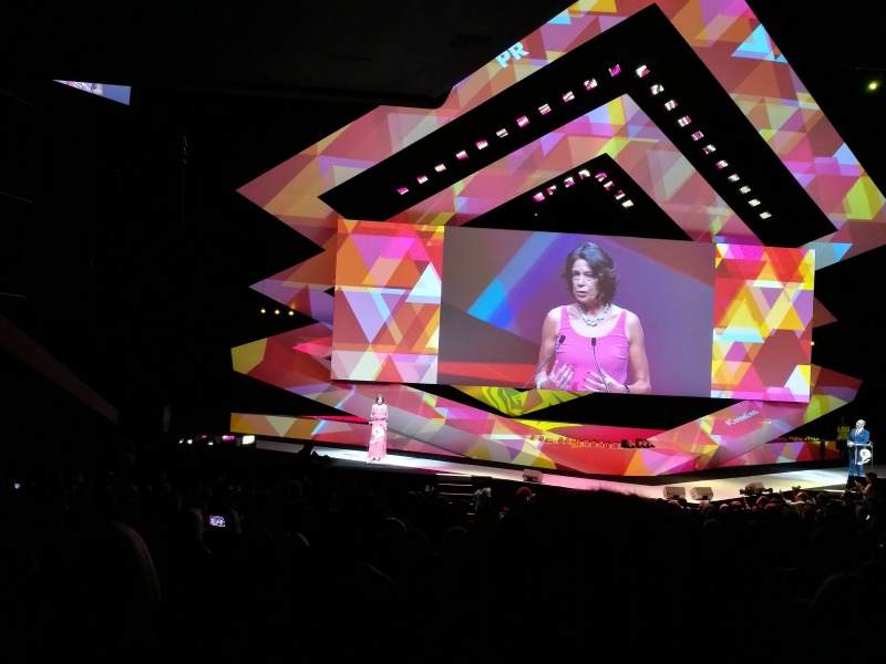
This year’s Cannes Lions jury deliberated for days in order to select the 15 Gold winners in the public relations category. Their selections were the result of careful consideration and robust debate. This list, on the other hand, is one person’s attempt to rank those 15 winners, based on nothing but his own opinion.
This is the first time we have attempted something like this, and so first of all, , I want to acknowledge that ranking 15 great PR campaigns is a highly subjective exercise. It will come as no surprise to regular readers that I have strong opinions. But listicles like this are designed to be provocative, to generate discussion, and I hope it will be equally unsurprising that I welcome debate and disagreement from anyone unconvinced by my arguments. Please push back freely.
Second, I want to emphasize that none of this year’s Gold winners offended me—which, given what happened in the PR category last year, came as a huge relief. So while some of these campaigns seem more Silver than Gold to me (and some of the non-Gold campaigns would have made my top 15), they are all worthy honorees.
Third, I followed the evaluation template outlined by jury chair Karen van Bergen as closely as I could. I looked for great insights. I looked for ideas that had earned media at the core (although my own definition of the category would focus more on the ability of an idea to impact stakeholder relationships than on the channels used). And I looked at results.
In the end, I suspect I placed a little more emphasis on results, or at least on a particular kind of results. I didn’t actually deduct marks for using advertising equivalency as a metric, but nor did I give it any weight. Instead, I looked for real, meaningful change. In the case of business campaigns, that means sales, or advocacy, or attitude; in the case of social marketing I focused on some evidence of behavior change.
Here’s the list:
15. Meet Graham (Public Sector winner)
Client: Transport Accident Commission Victoria
Idea Creation: Clemenger BBDO
PR: Clemenger BBDO
Perhaps more than any other winner in this year’s competition, this campaign had an “awards bait” feel about it. It’s no secret that agencies often take on not-for-profit or public sector clients because the issues they handle resonate with awards juries, and because they allow the use of shocking, emotionally-impactful (a cynic might say manipulative) imagery. I suspect all of us can bring to mind road safety campaigns that fit that particular bill—and some may remember the “Dumb Ways to Die” train safety campaign that swept Cannes four years ago.
While there’s nothing new about using art to illustrate and dramatize a health issue (the first award this organization ever presented was for a campaign that featured paintings demonstrating what migraines felt like), there’s no denying that Graham—a sculpture depicting how the human body would have to look in order to survive a traffic accident—was attention-grabbing (1.2 billion reach in the first week) and conversation worthy.
But like too many of the Gold winners still, there was an emphasis on advertising equivalency ($29 million) and no indication that the campaign had changed behavior; surely there’s an obligation to show some real-world impact when public money is being spent?
14. Unsafety Check (Social Media)
Client: Black Lives Matter
Idea Creation: J Walter Thompson
I really wanted to like this campaign more than I did. That Black people in America have to deal with a level of danger during every day activities—from walking to school to driving to work—is incontrovertible, and Black Lives Matter has been extraordinarily courageous in drawing attention to that reality, and challenging societal complacency. And there is no question that the election campaign and the rhetoric of Trump and his supporters created an even more dangerous atmosphere for people of color.
But this campaign—which involved hacking Facebook’s existing “safety check” functionality to create a simple app called the “Unsafety Check” that enabled Black people to express their alarm by marking themselves unsafe—struck me as almost entirely symbolic.
13. Teddy Gun (winner in charities and non-profit)
Client: Illinois Council Against Handgun Violence
Idea Creation: FCB Chicago
PR: Current Marketing
The “outcomes” section of the Teddy Gun campaign summary contains the following assertion: “The Teddy Gun campaign did what all the headlines on the gun epidemic that came before it could not: It created a conversation, inspired people to take action and motivated real change.”
It's an assertion I find problematic because I think it misstates the problem. There are plenty of conversations about guns in America—a new one starts with every major gun-related incident (although most of them consist of two sides talking past each other), and this one didn’t seem significantly different: it provided gun control advocates with a clever talking point, that teddy bears are more tightly regulated than handguns, but it’s not a talking point I would expect to sway many Second Amendment true believers.
As for the action people were inspired to take, all one can glean from the summary is that the client saw a record number of site visits. And the “real change”? “New legislation from Illinois Council Against Handgun Violence is gaining unprecedented momentum” sounds a little vague.
This is another one I wish I liked more than I do. It’s an important issue (and again, providing an ad equivalency measure rather than real behavior or legislative change, is particularly jarring because the issue is so important). Ultimately, this an issue that demands more than just a fresh news angle; it needs something that will change minds and I don’t see any indication of that here.
12. Pitching French Films to Hollywood (winner in celebrity endorsement)
Client: Alliance Française De Singapour
Idea Creation: Ogilvy & Mather Singapore
PR: Ogilvy & Mather Singapore
This campaign—the scripts of iconic French films were sent to Hollywood, where Hollywood script consultancies delivered scathingly oblivious assessments—left me more conflicted than anything else on this year’s winners’ list.
On the one hand, this is just smug French people poking fun at ignorant Americans. It’s a pretty cheap gimmick, and the video comes across—to an Anglo-Saxon, anyway—as snide and nasty. And I can’t help but wonder whether the editing was highly selective, with only the most clueless responses making it into the final cut.
On the other hand, there is a valid point in there somewhere about cultural hegemony and the need for different voices, and this is an amusing way of making that point. And one suspects that the target audience of cinephiles was receptive to an approach that probably reinforced their own prejudices—a conclusion supported by the fact that the campaign attracted 43% more non-French people to book tickets for the French Cinema screenings.
11. The Refugee Nation (Charities & Non-Profit)
Client: Amnesty International
Idea Creation: Ogilvy New York
PR: none
The Refugee Nation flag was designed by Yara Said, a Syrian refugee artist who was inspired by the colors of the life vests many of those fleeing oppression wore as they crossed the Mediterranean. It was turned into a cause célèbre by Amnesty International and Ogilvy as the official identity of the refugees competing at the 2016 Olympics as a team for the first time.
The Refugee Nation campaign garnered more than 2 billion media impressions; it became “a powerful symbol for these forgotten people”; it was embraced by celebrities from MIA to Jeffrey Tambor; it was exhibited at MoMA and the V&A. Did it provide any tangible benefits to refugees—increase sympathy for their plight, create more welcoming communities, raise much needed funds? There’s nothing in the “outcomes” section of the awards submission to tell us, and it’s easy to conclude that the campaign made a lot of people feel good without accomplishing anything very meaningful.
10. Spanish Lessons (Content-led Engagement & Marketing)
Client: Netflix
Idea Creation: Alma DDB
PR: none
I’m a fan of the Netflix series Narcos, so I was pre-disposed to like this campaign, which found a clever way to connect with those who have made the show a hit.
The campaign tapped into tweets and posts from people who said that watching Narcos had renewed their interest in learning Spanish, especially since the show featured some pretty colorful language that was not, presumably, part of many high school curricula. So the agency created its own content, with stars of the show helping people master phrases such as “eat shit” or “son of a bitch.”
There are some big metrics in the summary that are not entirely convincing: Netflix added 3.5 million new subscribers worldwide in Q3 of last year, but I’m not sure that this campaign was responsible for many of those, even if “Narcos Season 2 was named by the CEO as one of the biggest factors of the company’s success in his shareholder address.” This effort seemed more likely to deepen engagement with existing fans—and get them excited for season two—than to create new ones.
I liked it anyway. If you disagree, well, as Pablo Escobar might say: “coma mierda.”
9. Google Sheep View (Travel, Transport & Leisure)
Client: Visit Faroe Islands and Atlantic Airways
Idea Creation: LiquidMinds
PR: Ehrenberg Kommunikation, LiquidMids, Sansir, Travel PR, MGA Mediagroup
In some ways, this campaign was a classic underdog story: the tiny Faroe Islands was “so far off the beaten path that even Google Street View has yet to visit.” And it certainly had a creative hook—it selected a young Faroese women to tell the islands’ story, and she in turn equipped her sheep with 360-degree cameras to provide the images of the destination that Google wouldn’t. So it deservedly garnered significant media coverage and plenty of online buzz and persuaded “thousands” of people to petition the search engine company.
But the David (tiny island nation) and Goliath (global corporation) narrative is a familiar one in awards competitions; the device of using technology to track animals didn’t feel particularly fresh (see this winning SABRE campaign from a couple of years ago); and the metrics emphasized ad equivalency ($50 million!) and stopped short of demonstrating any impact on passenger or visitor numbers.
8. Coins of Hope (Integrated Campaign led by PR)
Client: Child Focus
Idea Creation: These Days-Wunderman
PR: Finn PR
A child is reported missing in Europe every two minutes, and many are never found. And the definition of news being what it is, the longer a child is missing the less newsworthy the story becomes—which means a PR campaign has to be pretty creative if it is going to draw attention to the long-term lost.
And this campaign was, coming up with a really big idea to put missing kids back in the news and then selling that idea to the King of Belgium, the European finance minister, and the 19 governments in the Eurozone—all of whom agreed to replacing the portrait of the king on the 2-euro coin with a portrait of a missing child.
The medium—one million new 2-euro coins were created—was an extraordinary delivery mechanism for the message, which generated massive media coverage, and resulted in one journalist tracking down one of the missing children who was the subject of a Child Focus campaign.
7. Savlon Healthy Hands Chalk Sticks (Healthcare & Wellbeing)
Client: ITC Savlon
Idea Creation: Ogilvy & Mather Mumbai
PR: PR Pundit
Unicef and the World Health Organization have produced plenty of studies with strong data on the difference that the simply act of hand-washing could make to child mortality in developing countries, and so Savlon’s efforts clearly addressed a real need.
And the core idea—of providing children with colored chalk sticks infused with soap—was remarkable in its simplicity and its effectiveness—although the scope of the program initially was limited to 150,000 children in 100 schools.
It seems a little curmudgeonly to quibble with a potentially life-saving idea, but I had two issues here. First, the campaign seemed a little derivative and me-too-ish: Unilever’s Lifebuoy has been promoting hand-washing in India for almost a decade, and the notion of using a surprising object to deliver health benefits echoes this anti-zika campaign from Ketchum’s Little George subsidiary. And the outcomes section of the entry doesn’t address either the public health results (lives saved) or business results (sales, or reputation) in anything but the vaguest terms.
6. Like My Addiction (Social Community Building/Management)
Client: Addict’Aide
Idea Creation: BETC
PR: none
Having criticized some of the other non-profit winners, I recognize that placing Like My Addiction so high on this list opens me up to a charge of inconsistency. It has many of the same faults, particularly when it comes to metrics: it cites earned media value (€10 million) and doesn’t really demonstrate and impact on attitudes or behavior beyond a massive increase in the amount of traffic to Addict’Aide’s website.
But it was ballsy, and that earns a lot of bonus points from me.
The agency created a fake Instagram account for a chic Parisienne called Louise Delage, who quickly amassed thousands of followers thanks to growth hacking techniques and who posted 150 photos, all of which featured subtle hints about her alcohol addiction—which was not revealed to her followers until the conclusion of the campaign, at which time the reveal video was posted on Instagram, Youtube and Facebook, and generated massive quantities of coverage, online and off.
It was an edgy and creative way to drive home a troubling point: that it’s easy to miss the warning signs of addiction.
5. The Impossible Signing Session (winner in live shows/concerts/festivals)
Client: Bol.com
Idea Creation: DDB Brussels
PR: none
It’s possible that I have been overly harsh on some of the non-profit and public sector work here: for one thing, I think such campaigns should be held to the highest standards of behavior change (not just awareness and engagement) and for another, I think it’s pretty easy to come up with a creative angle that generates media coverage for a good cause.
The Impossible Signing Session, on the other hand, gets bonus points for degree of difficulty. How many of us, asked to create a PR campaign for an online bookseller at a book fair, would come up with something as creative and as impactful as this campaign, which featured a new edition of a book by the celebrated but long-dead Belgian author Paul van Ostaijen and used technology that allowed people to write their own personalized inscriptions in the author’s handwriting and finish them off with a remarkable facsimile of his signature?
Like a lot of these campaigns, on one level this was “just” a publicity stunt. But one that showed just how much a well thought-out, brand-appropriate stunt can accomplish: close to 25 million media impressions (again, for a small company in a small market); a 5% increase in brand awareness; and a 40% increase in book sales.
4. Care Counts (Data, Analytics & Insight Generation)
Client: Whirlpool
Idea Creation: DigitasLBi
PR: Ketchum
There’s a lot to like about this campaign, which derives from an important insight: every day in America, thousands of kids miss school because they lack clean clothes—and kids who regularly miss school are seven times more likely to drop out. That insight clearly resonates for a company like Whirlpool, because it has the ability to address that issue in way that is both meaningful and relevant to its brand, and the Care Counts campaign does just that by installing washers and dryers in schools to provide kids with access to clean clothes.
The SABRE Awards judges liked this program a lot, but it missed out in 2016 because its scope was so limited: Whirlpool ran the pilot in only a handful of schools. But that’s less of an issue in terms of the Cannes Lions, because it was entered in the insight and analytics category, and in that context it excels: the insight, as described above, is brilliant, and the analytics are extremely impressive, demonstrating the impact an initiative like this can have on school attendance and performance. (And, since this is a corporate CSR campaign, brand awareness and brand love.)
Let’s hope the success of the pilot program leads to something bigger and more impactful in the coming year.
3. Cheetos Museum (Food & Drinks)
Client: Cheetos
Idea Creation: Goodby Silverstein & Partners
PR: Ketchum
A playful idea that tapped into consumer passion for Cheetos, the Cheetos Museum certainly had earned at its core: it launched with a sketch on Jimmy Kimmel Live!, supported by content featuring Cheetos that looked like Abe Lincoln and the Stature of Liberty, followed by coverage on Today and Good Morning America, ultimately generating more than a billion earned media impressions.
How passionate are Cheetos fans about the brand? The museum received more than 125,000 submissions, and eventually moved from its online home to New York’s Grand Central Station. And a Cheeto shaped like Harambe the gorilla sold for close to $100,000 on eBay.
There were strong business metrics too: the strongest sales week in the brand’s history, and a 1.5% increase in Cheetos’ share of the cheese-puff category.
2. Fearless Girl (Financial Products & Services, & Grand Prix winner)
Client: State Street Global Advisors
Idea Creation: McCann
PR: State Street Global Advisors (in-house)
The statue of the “fearless girl” facing down Wall Street’s charging bull created a powerful image, and the female empowerment message resonated around the world, generating a billion Twitter impressions in just 12 hours and featuring in more than 4,000 news segments. And State Street backed up the symbolism with the launch of the SHE Fund, made up of companies with a high percentage of women in leadership positions, providing credibility to the campaign’s goal of positioning the financial services company as a leader on gender equity in the financial services sector—a critically important issues.
There’s no doubting the power of the message, the success of the statue idea, or the fact that State Street matched its words with actions. But the entry’s assessment of outcomes left a lot to be desired. First of all, the inclusion of advertising equivalency (estimated publicity value $12 million) would have raised the hackles of judges in PR awards competitions. The SHE Fund experienced a 384% increase in daily trading in the three days after the statue was unveiled, but there’s no context—it’s conceivable that trading volume was negligible pre-unveiling—and no indication of whether the uptick was sustained (three days seems like an arbitrary timeframe). It would have been nice to see some metric like net promoter score: were people more likely to recommend State Street as an employer, or to investors, after this effort?
But those are minor issues with a campaign that addressed a pressing issue in a way that captured the public imagination like no other. Last year’s Grand Prix winner was an embarrassment, to Cannes and to the PR industry. This year’s was a truly brilliant concept, well executed.
1. The DNA Journey (Travel, Transport & Leisure)
Client: Momondo
Idea Creation: &Co.
PR: Radius Kommunikation
This was a courageous campaign for an online travel company to undertake, inviting people to confront their own prejudices and confronting them with some potentially uncomfortable truths. But momondo was founded on the idea that “travel can break down the boundaries between people,” so The DNA Journey was an organic extension of the company’s brand and vision.
The company interviewed 67 people from around the world and then asked them to take a trip to explore their heritage based on DNA test results. The resulting videos were extraordinarily compelling—a man who was “not a fan of the Germans” discovered German ancestry, a woman who has “a side of me that hates Turkish people” traces part of her DNA to Turkey—and were viewed close to 400 million times. And 170,000 people signed up to take their own DNA journey.
The business results were compelling: traffic to the site increased 45 and 43% in the two days after the campaign launch and momondo’s global market share increased by 2% as a direct result of the campaign—metrics surely strong enough to overcome any concern about the use of advertising value equivalency in the write-up.
A bold idea, a timely issue, direct relevance to the brand mission, brilliant creative execution, impressive business results—this campaign had it all.








.jpg)


